![[IMG]](../../../assets/img/network-switch.B.jpg)
A Bad Flag For Manitoba
On Sunday 2 February the CBC website had a story titled Is Manitoba’s 150th a chance to redo province’s flag?
The CBC story said Manitoba’s flag is noted for its bad design.
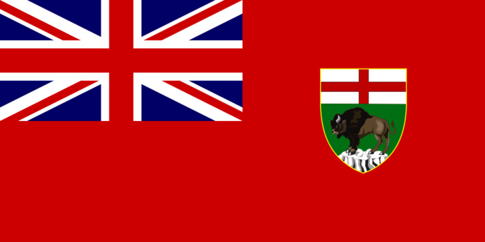
A group of 20 experts from the North American Vexillological Association graded all 72 North American provincial, state and territorial flags (PDF) as part of a NAVA flag survey in 2001.
Manitoba came in 44th place, the worst ranking of all provincial flags. The province’s flag is criticized for bearing a close resemblance to Ontario’s, which placed 43rd.
Undeterred by NAVA’s cricitcism, I set about designing a flag. Since I’m not capable of designing a good one, I set about creating a bad one.
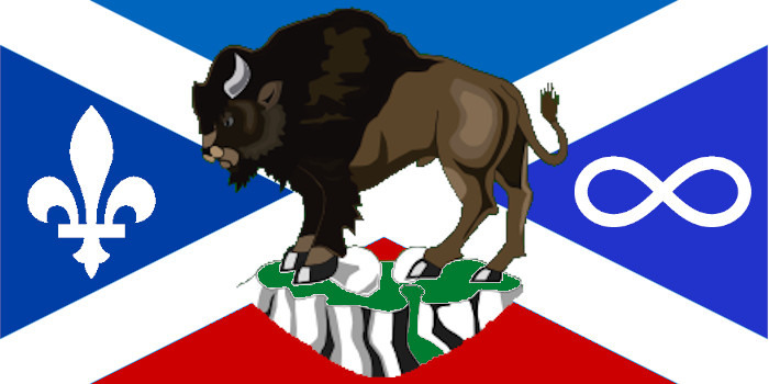
The flag combines the following multiple elements:
- The flag of Scotland in the background, to commemerate the Red River settlement
- The top blue also represents the sky
- The bison in the foreground, which is the primary symbol of Manitoba and also
represents Manitoba’s Indegenous people
- I added some green to the ground the bison is standing on to symbolize Manitoba’s grasslands and forests. The grey and black represent the Canadian Shield.
- The Canadian-style Fleur-de-Lys to recognize the French
- The inifinity sign is the symbol of the Manitaba Metis Federation
- The red at the bottom symbolizes the British
Note there is nothing to commemerate immigrants from other parts of Europe, such as Germany (Mennonite, Hutterite) or Poland and Ukraine.
This flag violates a couple of suggestions contained in a pamphlet from the North American Vexillological Association titled Good Flag, Bad Flag (PDF):
-
Keep it Simple: The flag should be so simple that a child can draw it from
memory
- The flag combines seven separate elements (Scottish flag, bison, fleur-de-lis, MMF symbol, red for Britain, green for vegetation, Canadian Shield)
- I’m no child, but I certainly can’t draw the bison from memory, and the Fleur-de-Lis is tricky as well
- The bison is large and rather overwhelming
-
Use 2—3 Basic Colours: Limit the number of colours on the flag to three,
which contrast well and come from the standard colour set
- The flag has no less than six colours; and nine if you count all the shades: white, three shades of blue (two of which are practically indistinguishable from each other), green, two shares of brown, grey, and black
- I considered throwing in the Manitoba Tartan, but couldn’t really find a place to put it
It does, however, meet three other criteria from the pamphlet:
-
Use Meaningful Symbolism: The flag’s images, colors, or patterns should
relate to what it symbolizes
- See above
-
No Lettering or Seals: Never use writing of any kind or an
organization’s seal
- The bison sort of violates this one
-
Be Distinctive or be Related: Avoid duplicating other flags, but use
similarities to show connections
- I rather doubt it would be mistaken for any other flag